Restaurant Point of Sales
Re-envisioned
Restaurant Point of Sales software
Re-envisioned with insight.

DotPe - March 2023
SAAS • Product (Re)Design • Case Study

Overview
Rista is a 10 year matured enterprise - grade POS system, that has been recognised as an all in one solution catering to all management and sales related functions for the F&B industry.
I lead the design research, rebuilding the framework, prototyping to give Rista POS a whole new life, under the guidance of my manager Aman Kumar. I also worked with developers to ensure that we deploy beyond expectations.
This was a highly ambitious project but Rista’s new user experience was highly appreciated once launched & emerged as a highly sort after solution in the market.
My Role
Founding UX Designer - User research, Information architecture, Wireframes, Visual Design, Prototyping
Timeline
8 Months - Launched March, 2023
Tools
Adobe XD, Figma
OUTCOME HIGHLIGHTS
A Restaurant Billing POS that does so much more!!
Business excellence through enhanced user performance.

Order Taking Time
Order Taking Time
1.5 mins
2.2 - 1.5 mins
Reduced by
Avg. Order Journey
Avg. Order Journey
5 clicks
8 - 5 clicks
Reduced from
Avg. Order Acceptance Time
Avg. Order Acceptance Time
30 secs
2 mins - 30 secs
Reduced from





Choose Mode
Keshav’s Order
#7860

Have Here
Takeaway
10%
10%
Existing users switched to the new UI in less than 6 months
Revenuw
Revenue
30%
30%
Increased By
New acquisition onboarded
75%
75%
Outcome & Statistics
Video Loop
THE CONTEXT
The Convolution of Selling Food.
The Convolution of Selling Food.
Rista Sales is a Point of sales SAAS product that enables a merchant to process and monitor his business’s performance and operations with a much greater degree of efficiency as well as accuracy.
What is Rista Sales?
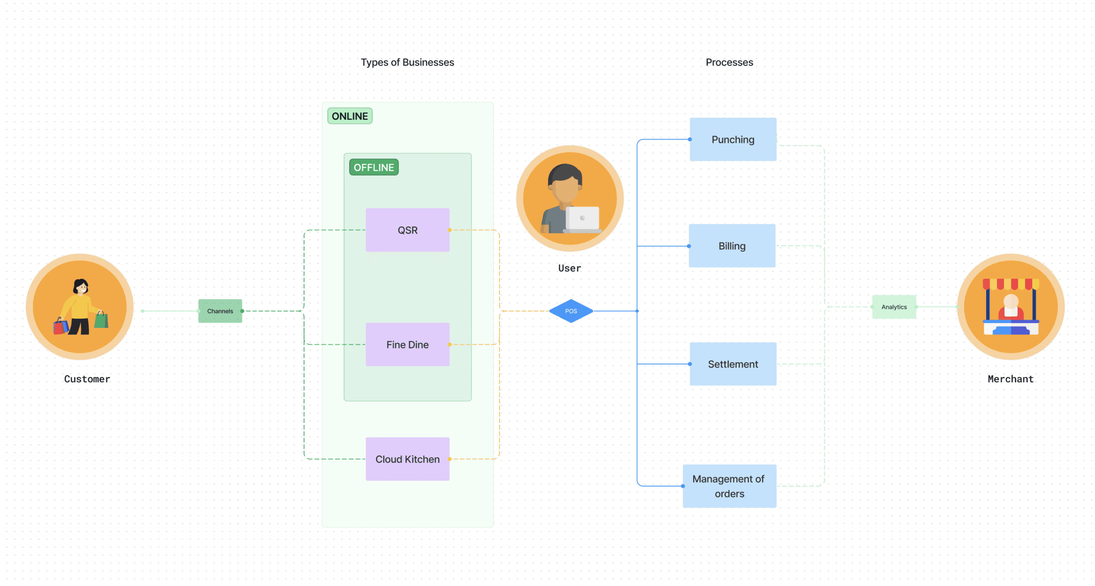
Overall stakeholder mapping
Image
The existing system we had was a great solution build on insightful understanding of the business and its function but little to no understanding of the user and their behaviour, which evidently came in the way of enhancing the business’s performance.
Studying the existing system
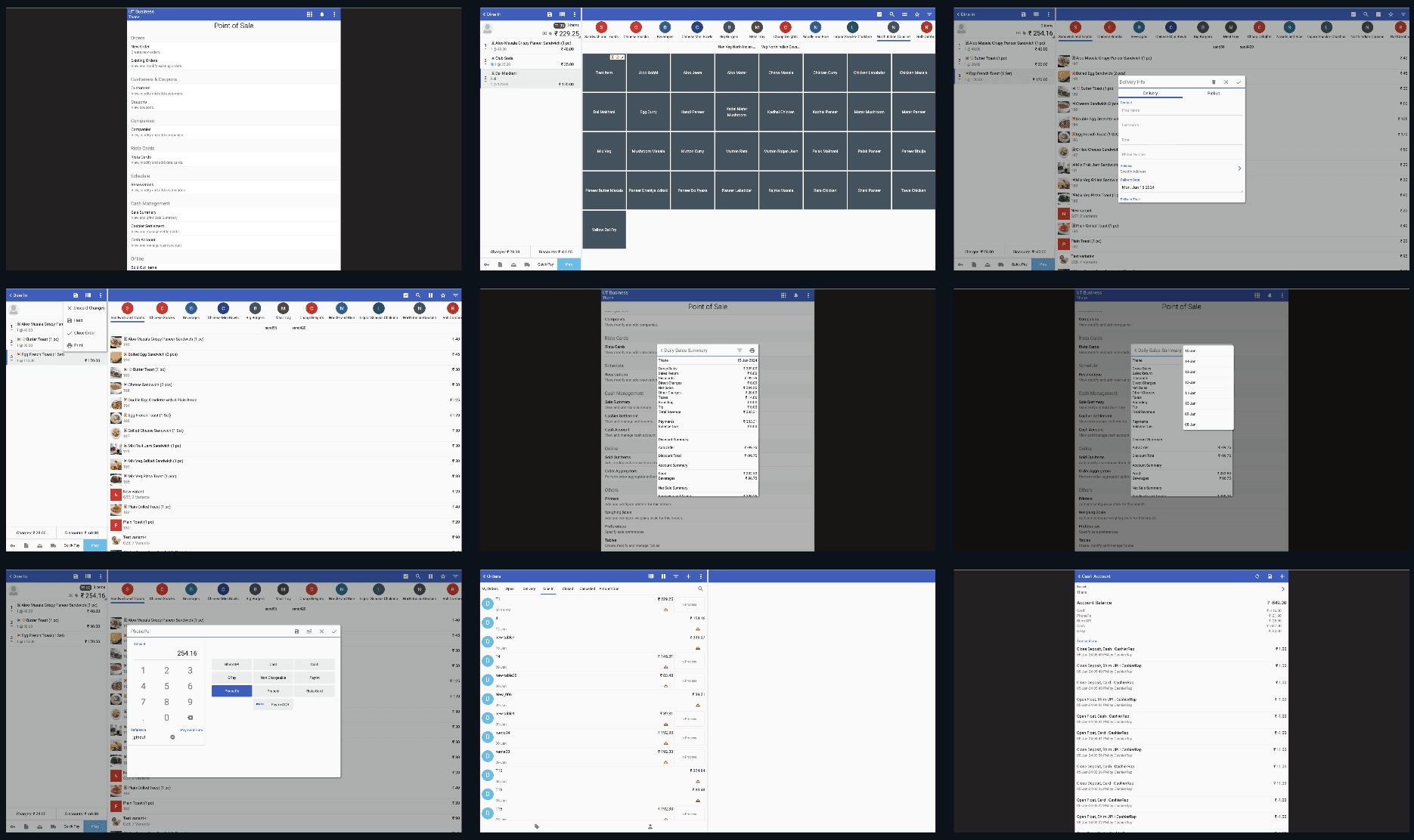
Screenshots of the existing Rista UI
Image
THE PROBLEM
This got to be more than just a typical UI update
This got to be more than just a typical UI update
Rista as a solution is precisely manufactured with an insightful understanding and knowledge of the food business. But it fails on the usability and accessibility front. It has all features but lacks visibility of those hence compromising excellence.
The product does not require enhanced aesthetics but a reimagining, a shift in perspective from the buyers point of view to the users point of view. But that had to be done within some constraints:
The Root and Constraint
Limited to Front-End: The first launch was going to be limited to changes in the frontend only
Configuration nuance: Offers many configurations which makes the product very layered
Existing customers & Licences: Current customers base’s switch had to be seamless
THE CHALLENGE
To turn an otherwise complex solution into a simple & intuitive one for all use cases while enhancing usability & accessibility.
The North Star
Thoughtful Reduction
Rista as a solution is precisely manufactured with an
Quick Decision Making
Rista as a solution is precisely manufactured with an
Clarity & Structure
Rista as a solution is precisely manufactured with an
THE APPROACH
Stripping down the solution to its essence and creating a refined experience of simplicity and enhanced performance.
THE METHODOLOGY
Growing deeper roots.
Growing deeper roots.
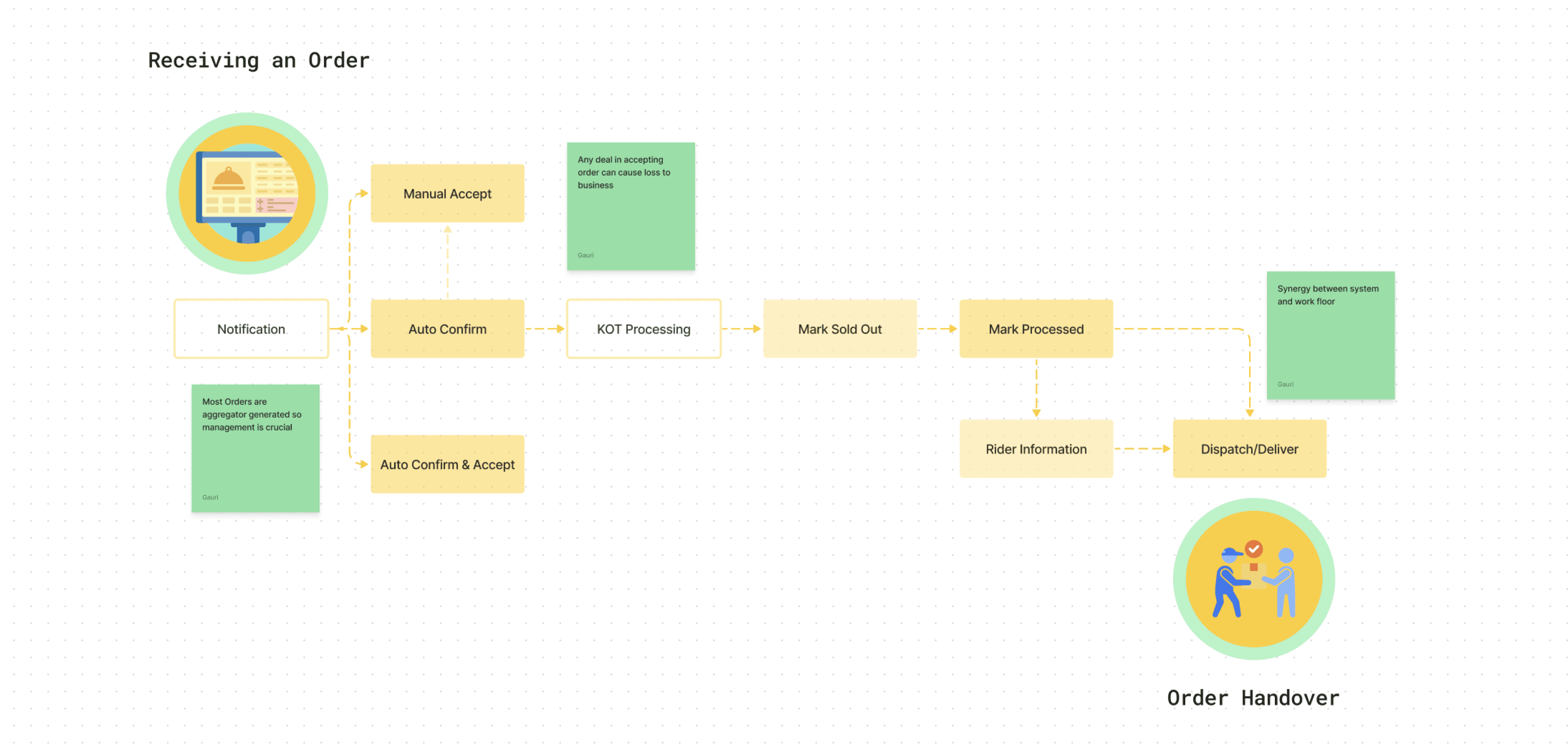
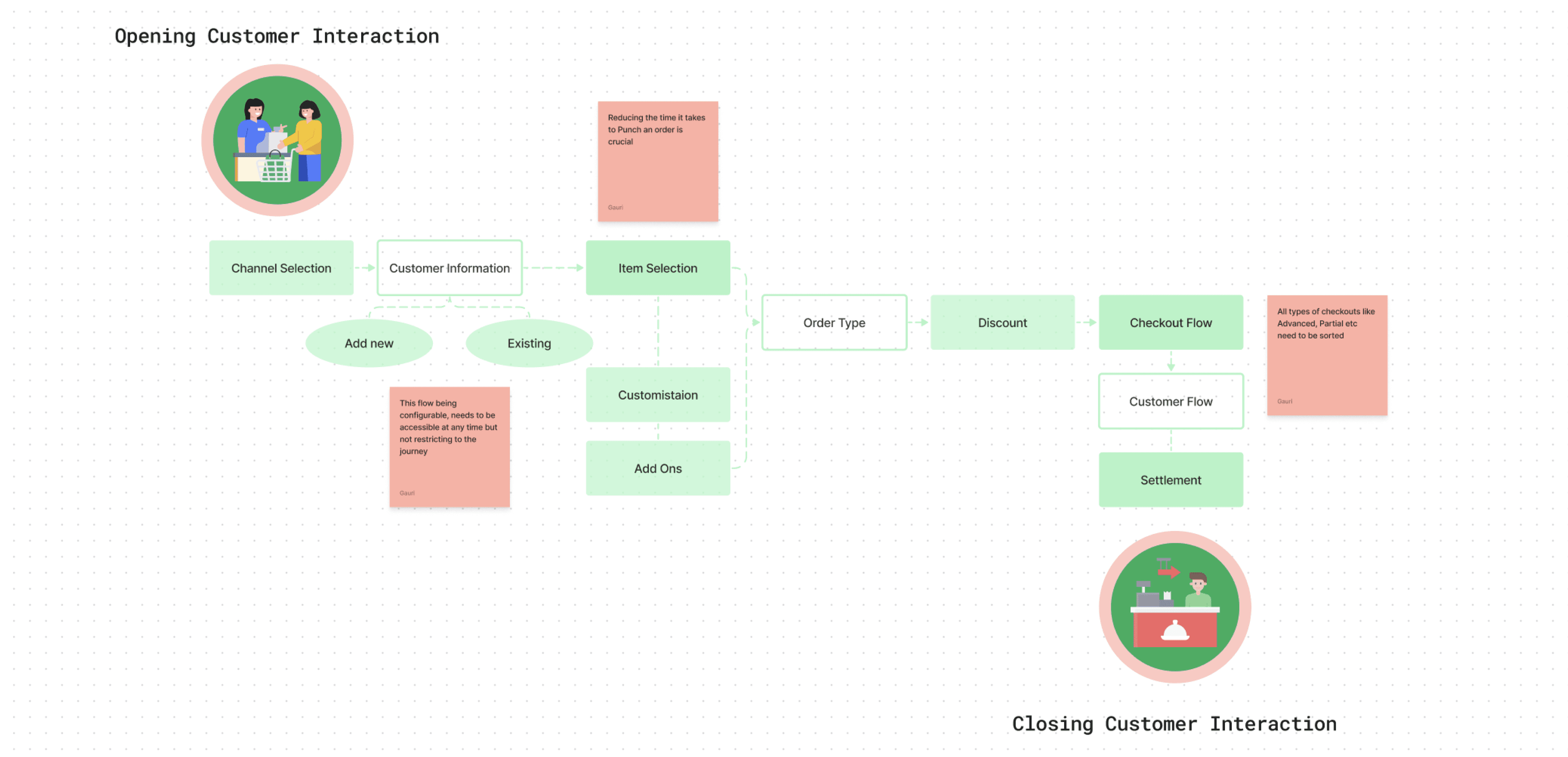
One of the first things to do was to understand the intricacy of the product and start to simplify the structure and all the user journeys .
Finding structure amidst the chaos
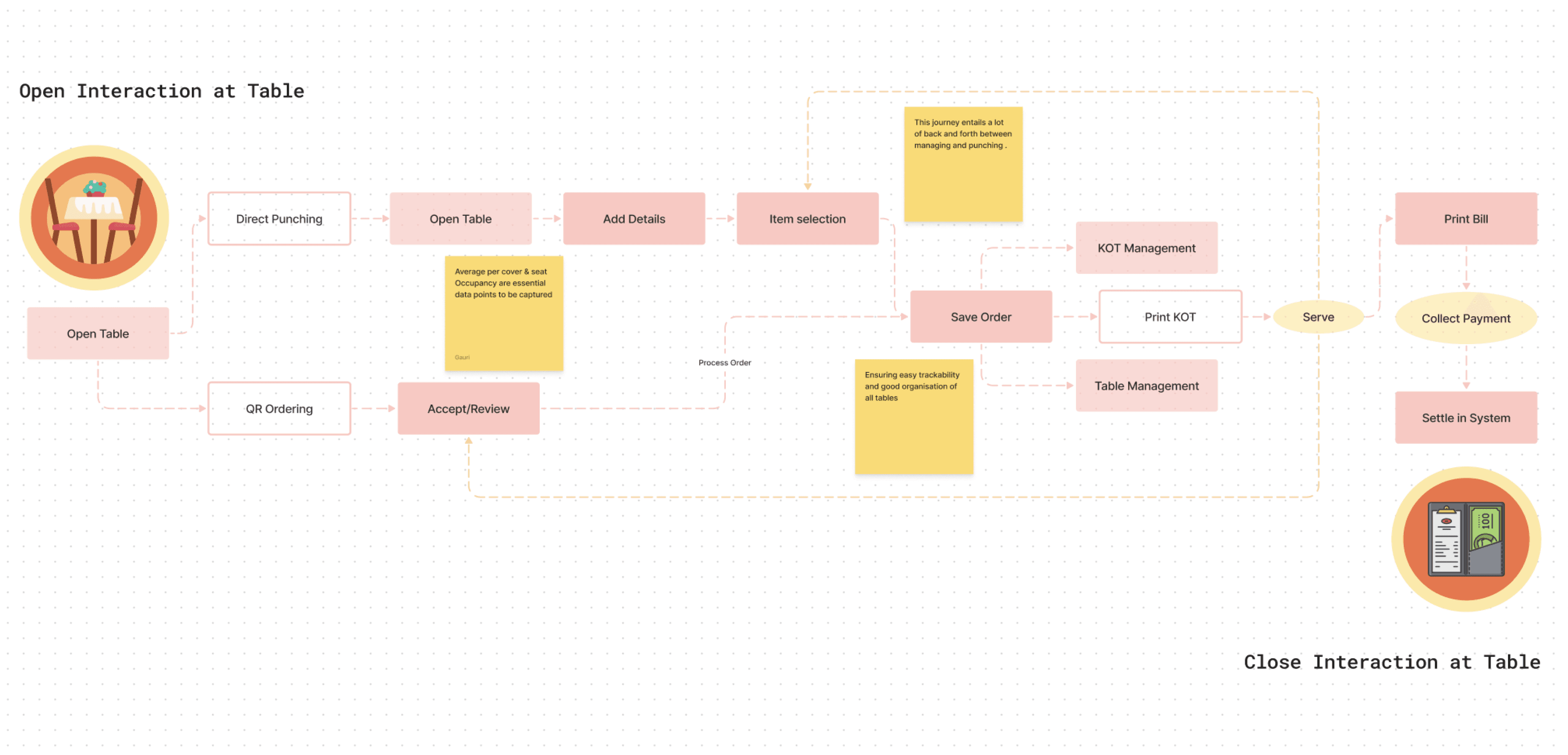
Quick Service Restaurant
Cloud Kitchen
Fine Dine Restaurant
Fine Dine Restaurant
Fine Dine User Journey Mapping
Interactive
The Point of sales is a complex system as it caters to many different use cases and configurations. hence, it is even more important to make the flows as accessible and simple as possible.
But there were some evident flaws that hindered the experience & performance in multiple ways:
The gaps that were evident
Huge training cost involved as the system is not intuitive enough
The Lack of Navigation & Visibility makes the system more of a hassle than solution
The no. of clicks & time taken to do simple tasks is significant with current architecture & layout
Same icons do different things and leaves the user lost
No display of all activities in the same place for better management
Giving the features visibility & making the experience more visual is going to guarantee faster, efficient execution of repetitive tasks.
KEY INSIGHT
Punching
Billing
Partial Settlement
Cancel
Accept
User Action
Process
Mark Delivered
Handover
Mark Sold Out
1.1
1.2
1.4
1.3
1.5
1.01
New
Processed
Delivered
Dispatched
Dispatched
Cancelled
2.1
2.2
2.02
2.01
Open
Closed
Amount Due
Cancelled
Online Aggregators
QR Ordering
Self-Punch
Fulfilment Status
Settlement Status
Channels
The journey of an Order
Image
I started by reimagining the structure around the order journey. Simplifying, to find patterns that can ease out the knots and make it all sing.
Rebuilding the framework
The first thing to do was to rebuild the information architecture considering user journeys and flows to ease the functioning.
Laying a strong Foundation
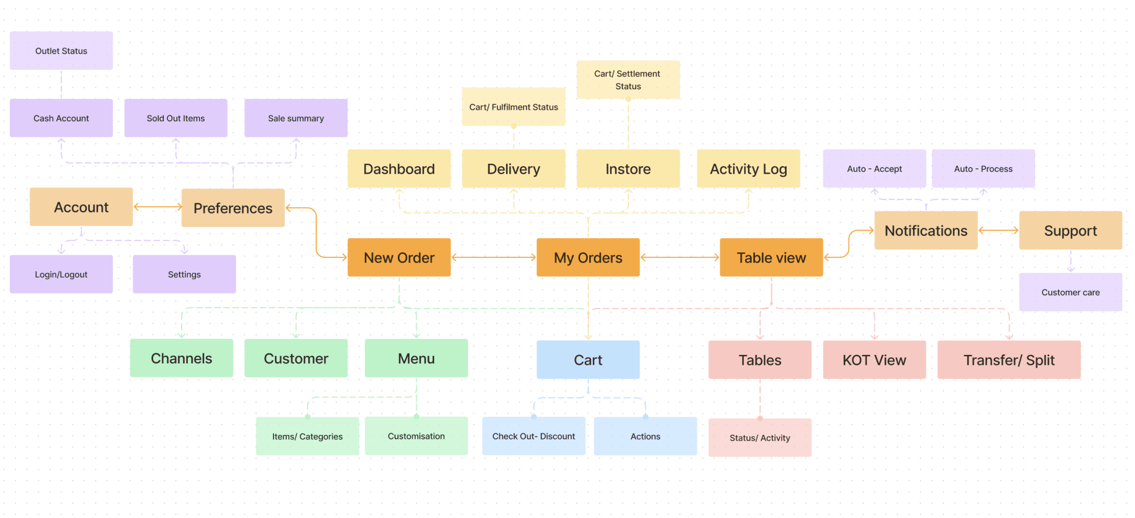
New Information Architecture
Image
Intuitive functions to reduce training cost & enhance adaptability
Crisp Navigation & Visibility to go from anywhere to anywhere in secs
Less clicks & Less time with informed and intuitive flows for faster everything
Consisted design language for uniformity, accessibility & scalability
Display of all activities in the same place for better management
The high level audit included creating a navigation bar that could make management easy and instant, but all while using minimum real estate.
Getting the Quick fixes in
Navigation bar concept
Video loop
THE LAYOUT
No jazz, Simple, Consistent & Scannable.
No jazz! Simple, Consistent & Scannable.
One of the main alterations made to the layout was the placement of the cart from left to right to support the general order taking flow.
Make the head shake stop.
User Journey overlay
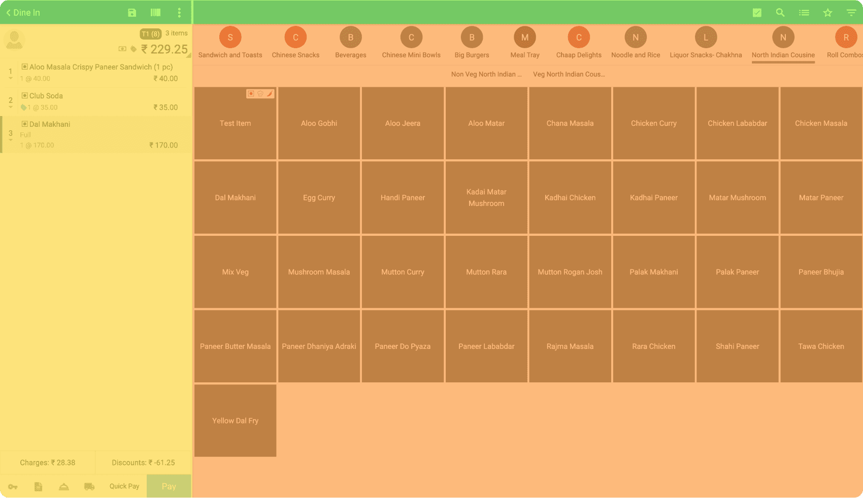
Lot of back and forth in the process as the layout is section driven
Old User Interface layout
Interactive
User Journey overlay
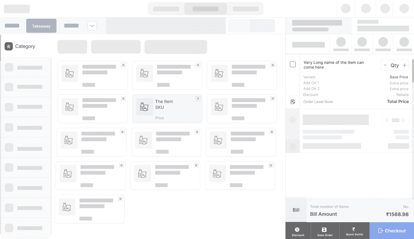
Fluid yet structured movement as process is action driven
New User Interface layout
Interactive
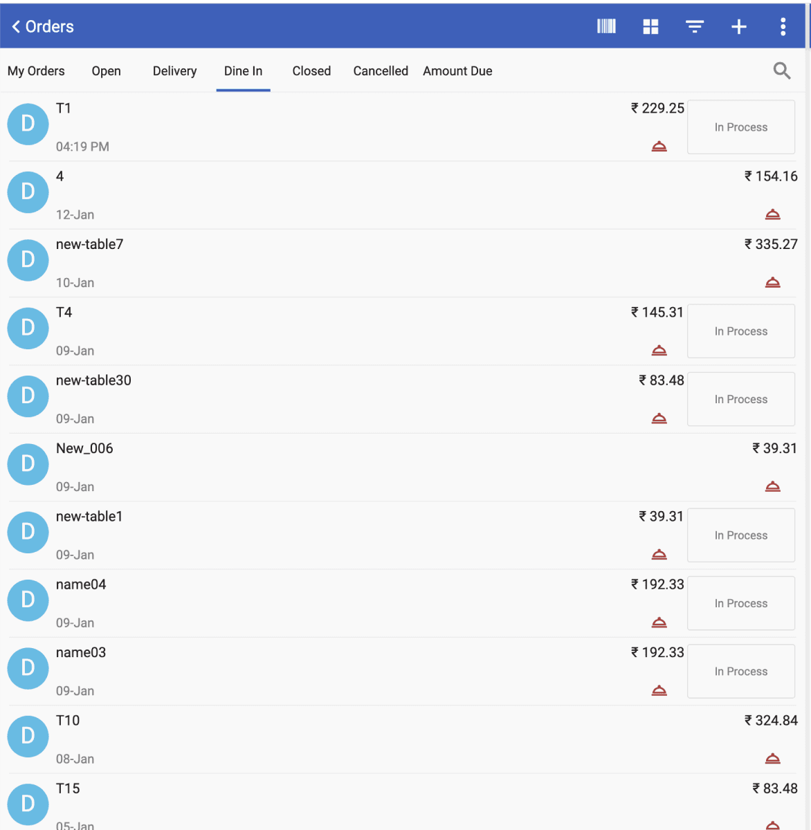
My Orders Old Layout
Image
List Layout for all Orders
Not Glanceable as their is no distinction between any orders
State of an order is not clear hence difficult to know where action is required
User must click on each order to know any kind of details of the order
My Orders New Layout
Image
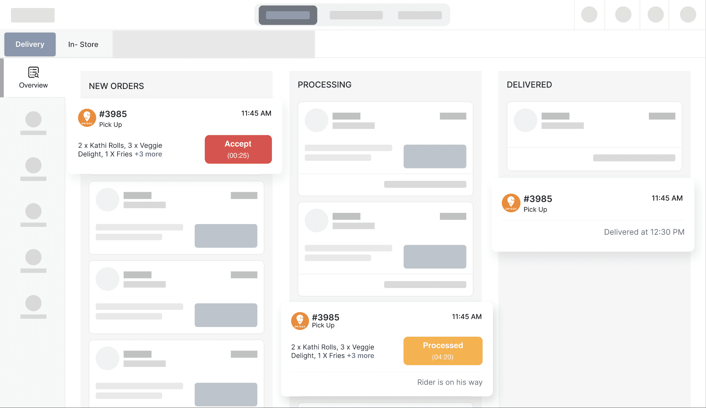
Card Layout for Overview
Glanceable Orders as they are sectioned according to journey
All CTA’s are colour coded and timed so its easy to know where action is required
Relevant meta data available on order cards to ensure visibility & trackability of order
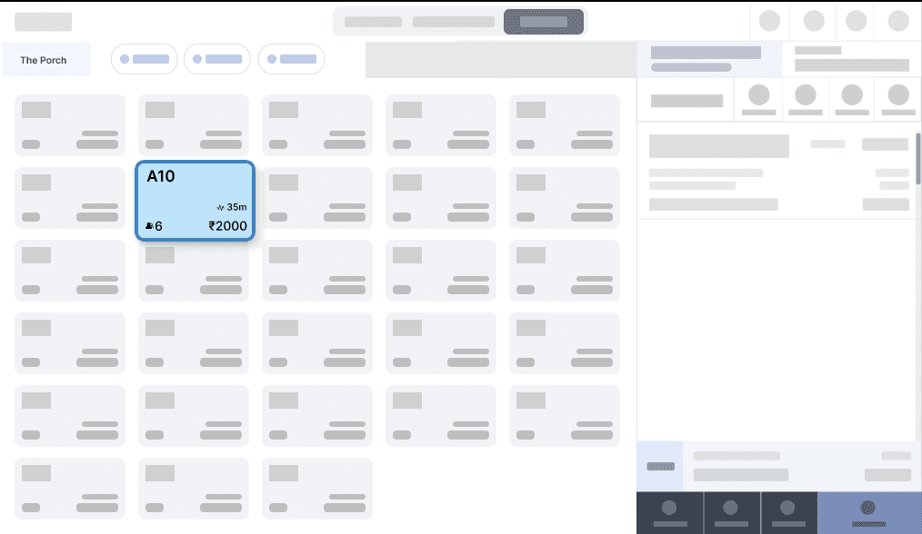
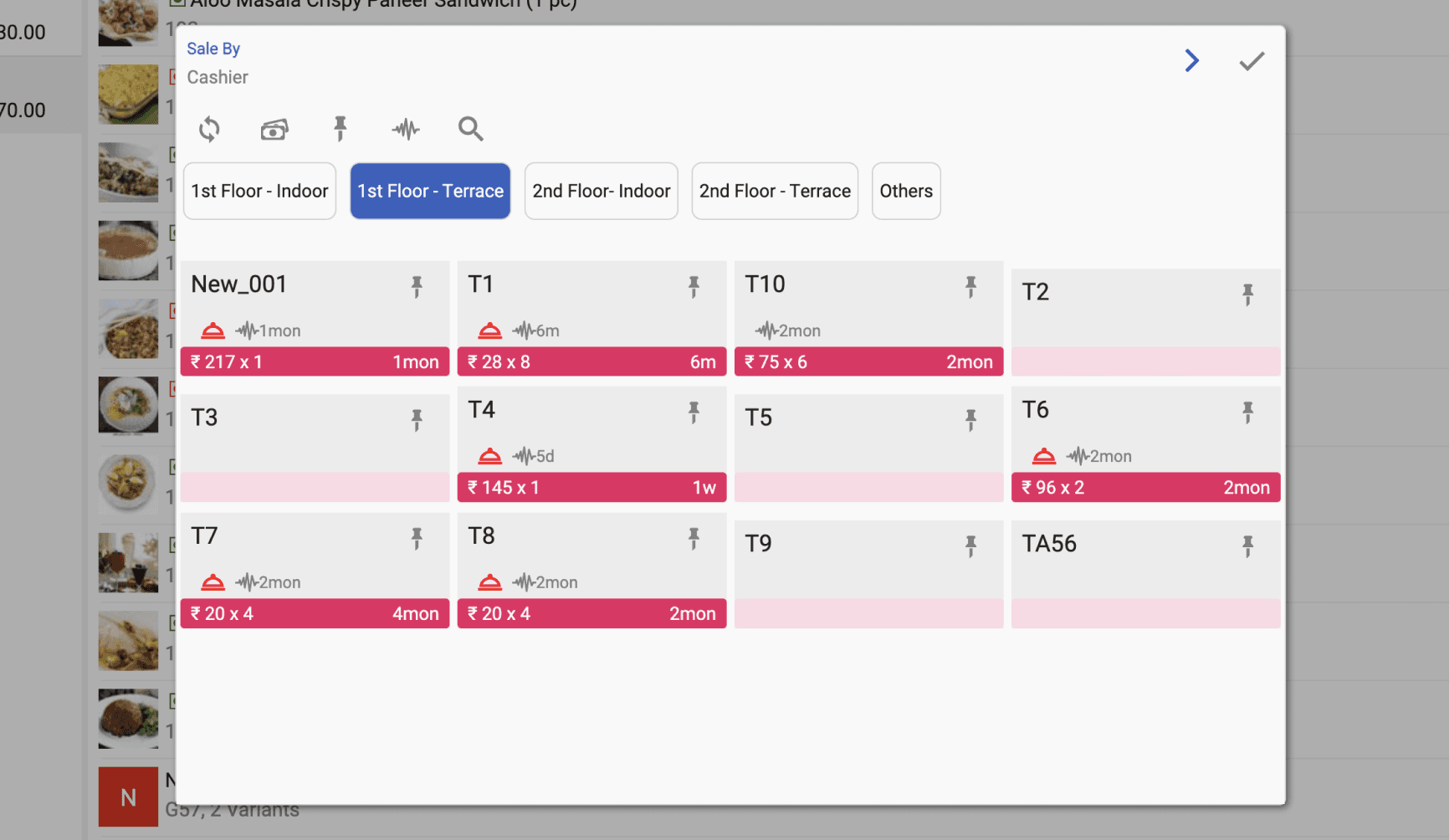
Limited to a pop-up and cofusing
An entire screen to easily manage tables
Significant Meta data made glanceable
My Orders Old Layout
Image
THE OUTCOME
Making effortlessness POSsible!
Making effortlessness POSsible!
The attempt has been too enable the user to spend less time on decision making, simplify the task, enhance performance by reducing scope of error and eventually develop muscle memory as most tasks are repetitive.
Reduce effort; Inspire performance
Overall Billing flow Prototype
Video Loop
The user ends up spending the most amount of time punching an order where the communication between the customer and the user needs to be fed into the system.
To make this repetitive process easier for the user, it was important for the system to be organised, simplified and visually accessible.
Find Fast, Punch Faster
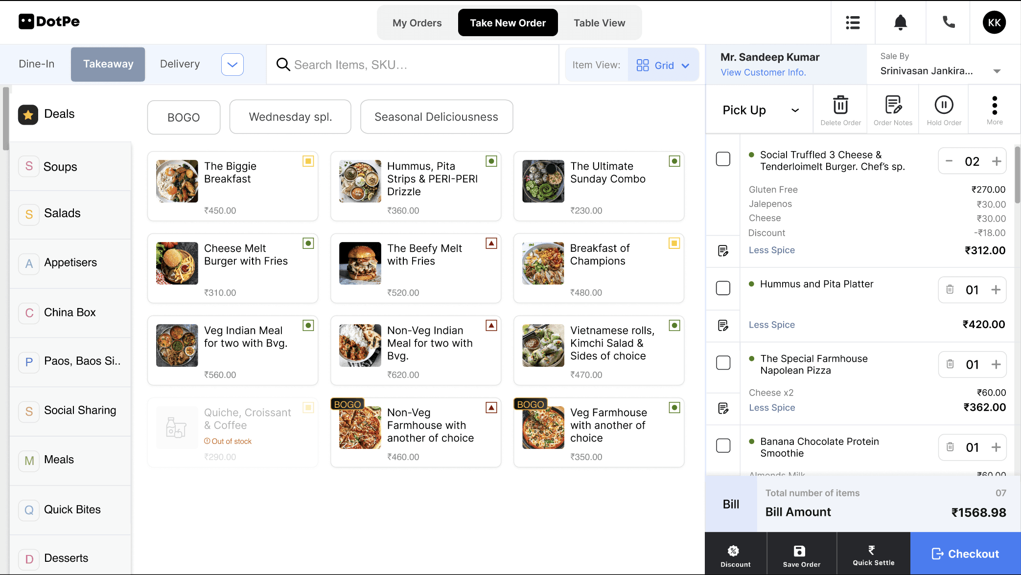
Long Item Name Can Long Item Name
₹ 60.00
03
Social Truffled 3 Cheese & Tenderloimelt Burger. Chef’s sp.
SKU554
03
₹ 270.00
Hold Item
Delete Item
Add Add-Ons
₹312.00
+ Add Discount
Toasted bread with cheese slice | Veg |
Gluten Free (Ragi & Barley Mix)
Less Spicy
No Garlic
Jalepenoes
₹ 30
Cheese
₹ 30
Wednesday Offer Discount
-₹ 10
Customise
In-Stock
Back Order

Jain
Sugarfree Long
Less Spice
No Garlic
No Onion
No Nuts
More
Easy channel switching
Every customisation option made more visible and accessible
Full control over every change made to the item, all at a single glance
Efficient navigation with enhanced accessibility
Notes
Delete Item
Hold Item
Less Spicy
No Onion
Sugar Free
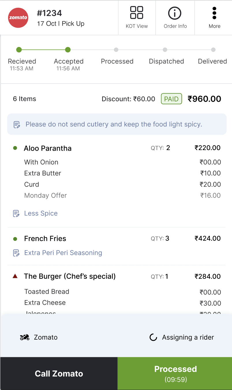
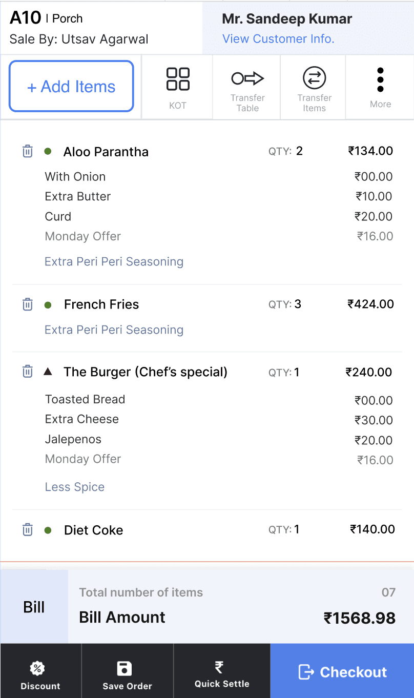
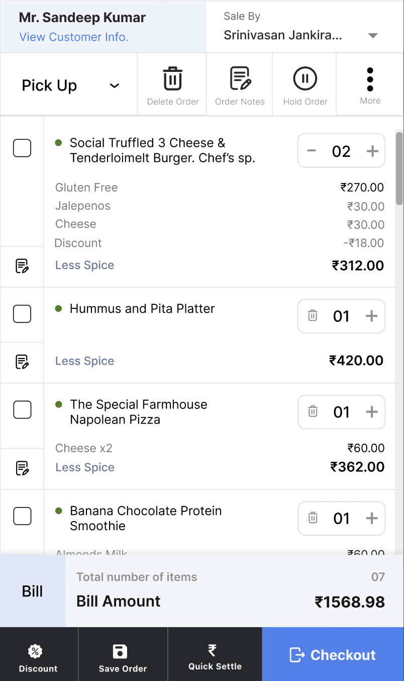
Carts that puts the user in total control with minimum clicks and maximum efficiency
Bigger the restaurant, more important is this mapping of orders to table. Management of tables directly affects the smooth functioning of the Business.
The idea was to design a solution where the user could View, Add and Manage all tables in one place for a hassle free and smooth running restaurant.
Easy to Track, Easy to Run
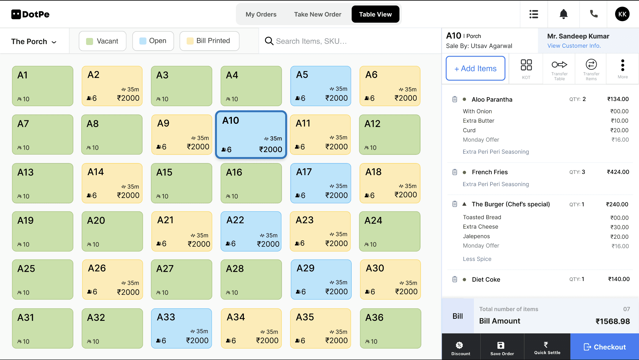
Colour coded tables with one click filtration
Track the status & all activity of any table, instantly!
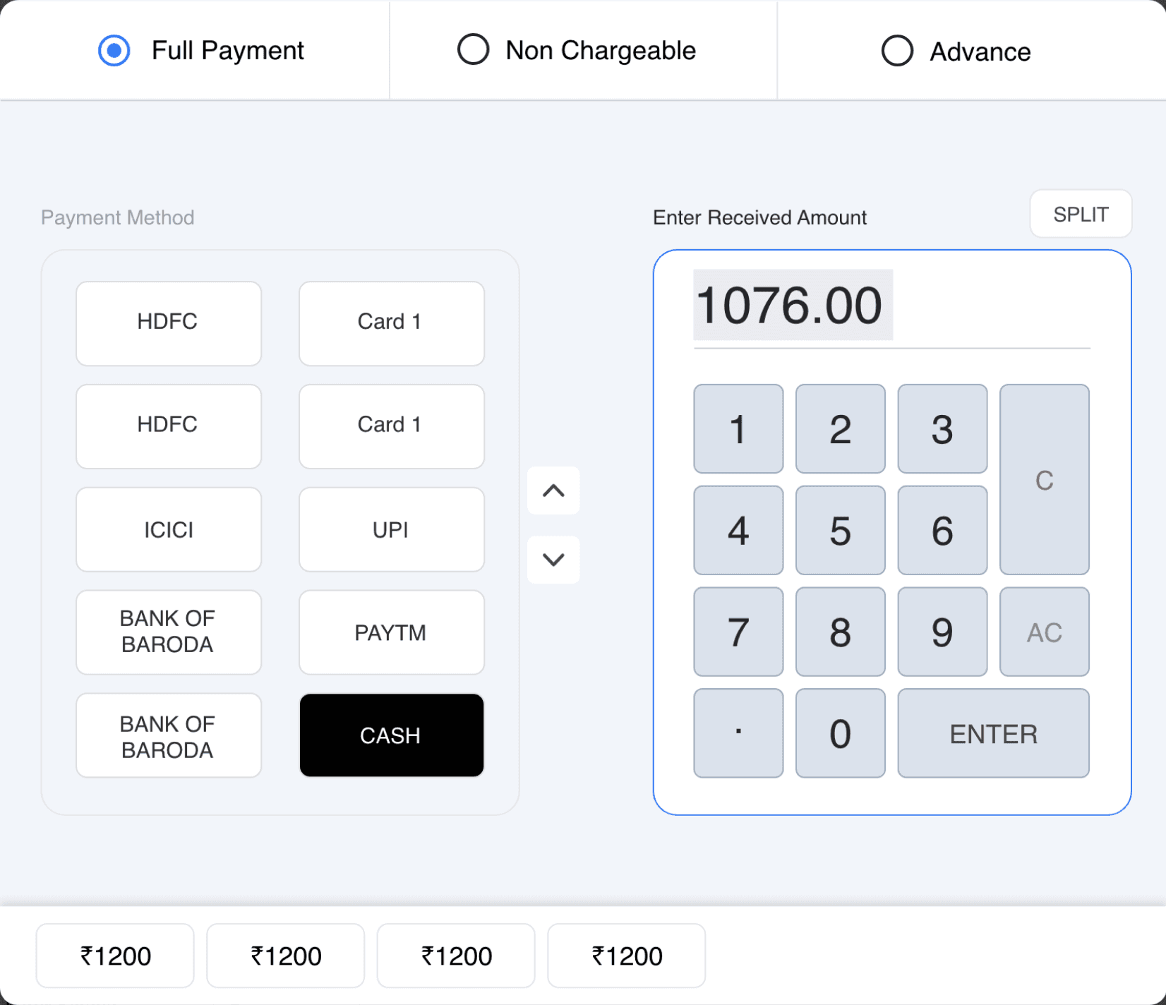
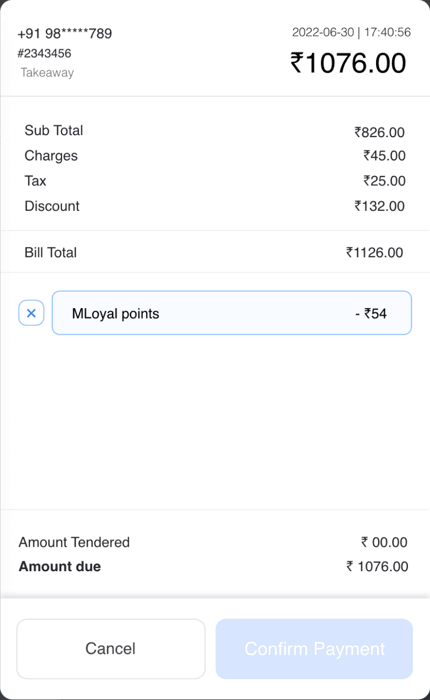
All payment modes to choose from
Bill along with all details in view for reference
Payments methods & calculator with a flow designed for ease
Prompts & other important data
An order has a journey and it can be difficult to keep track of all milestones. Most loss was caused to the merchant due to the delay caused in processing online aggregator orders.
To solve for this, we now give our user a view that enables him to smartly and efficiently take action where and when required to delivery best results.
As this task involves an element of time, we designed an Overview of all online orders, in their journey organised by priority of action required for seamless functionality.
Never miss an order!
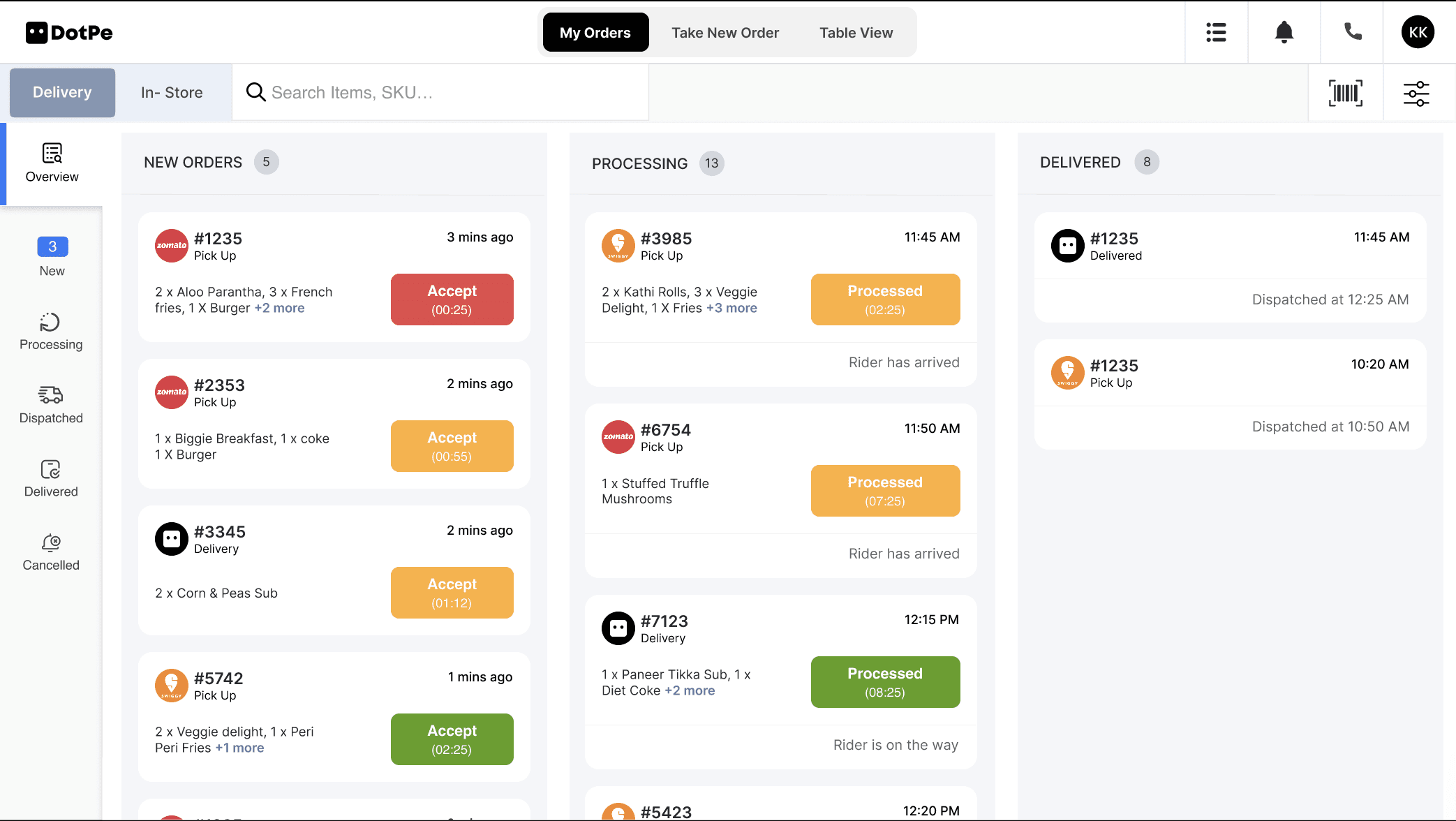
Restaurant’s entire business at one Glance
Orders arranged in priority of action and bucketed into stages of order journey.
Time based colour coded CTA’s to prompt action along with status of order and rider
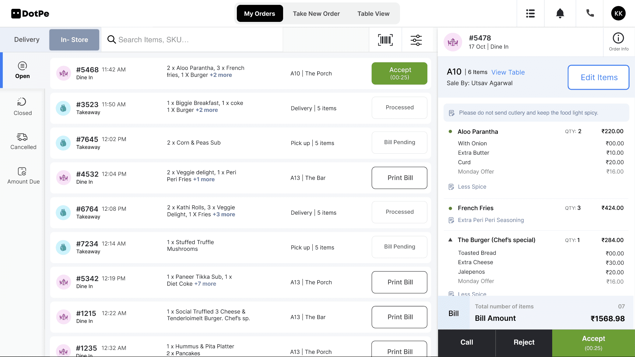
Switch between Delivery & instore orders at your convenience
Close Order, Switch back to Table view or Add new items and much more, with just one click
IN HINDSIGHT
Touching the tip of the iceberg
Touching the tip of the iceberg
An average order acceptance time was reduced from 2 mins to
30 secs and the overall revenue was increased by 30% from the new acquisition on Rista .
HUGE SUCCESS!
After a lot of trial and error, Rista was finally launched in March 2023.
75% of the new acquisitions were onboarded on the new UI & 10% of the total outlets started running on the new UI in less than 6 months, as of Oct’ 23.
We also managed to reduce, an average order journey time from 2.2 mins to 1.5min, and the takeaway order journey flow from 8 to 5 clicks.
But that only marked as the beginning of crafting the best POS in the world!
The Outcome
Personal takeaways:
Things change fast across teams and so it’s important to be open minded & ready to pivot whenever.
Embrace ambiguity
While conceiving such a vast project, it’s important to have all expert voices on the table beforehand as they may have key pointers to add which can come up as constraints later.
All departments should be involved from the start
What is produced is a result of many minds & insights so authorship doesn’t have a place even when the ego insists.
No good design is eligible for authorship
Looking back i see so many choices I made as not good enough or even relevant but that perspective itself hints growth.
To see the flaws is growth!
UP NEXT :
OneHealth: Reimagining holistic health and sustainability
Wicked problem capstone
It's nice to have you here! 🦚
This is my digital heartspace where you may explore my work to see how I'm making a living, dive deeper into my knacks to see how I'm living a making, check out what I'm upto & learn more about me or read my CV for a glance at my professional life. But whatever you do, know that only love surrounds you!! :)
Copyright © 2024 Gauri • Made with 🩵 in the Hills!


